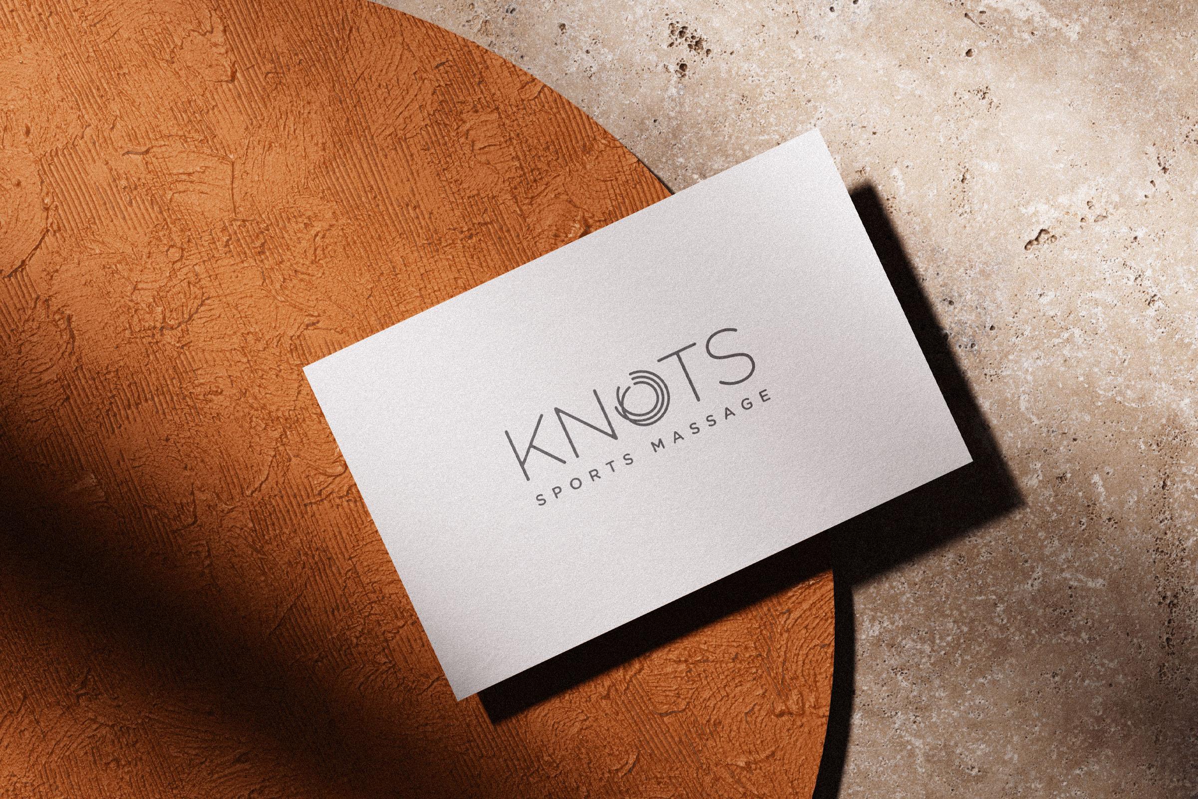
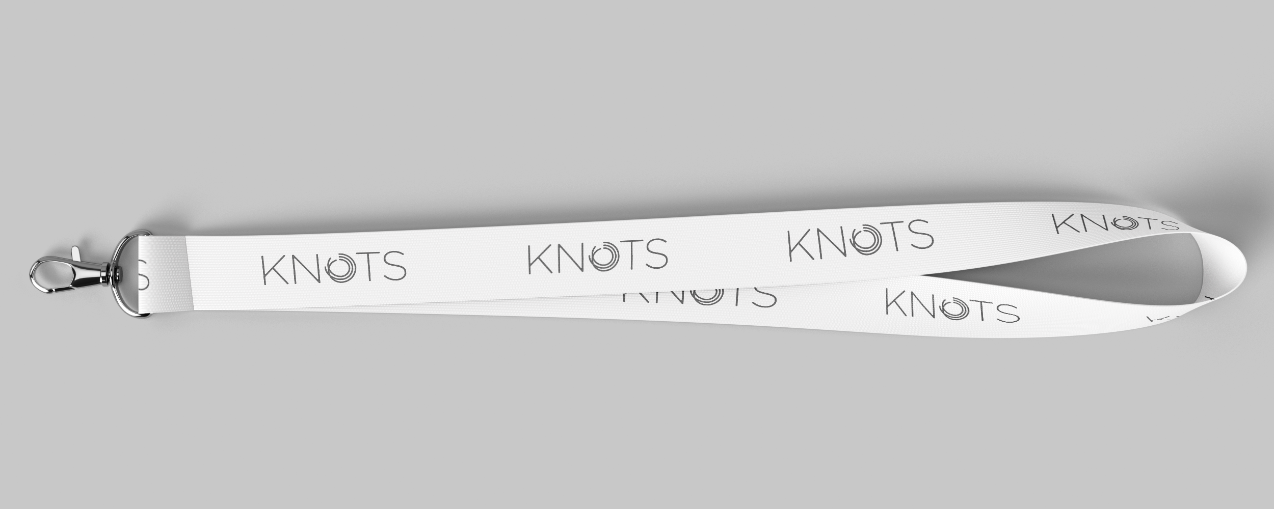
Knots
Brand design for Sheffield-based sports massage clinic, Knots.
The circular icon represents the release of muscular tension and restriction, restoring balance and guiding the body back to smooth, efficient movement. The continuity reflects that rehabilitation has no fixed beginning or end; it’s an ongoing process built on structure, repetition, and patience.
- Branding
- Photography
- Web Design
- Web Development